Danish Design Firm HAY Heralds Its 20th Anniversary With a Superb, Highly Tactile Book
While the Danish design firm HAY is just celebrating its 20th anniversary this year, it has achieved a rarefied place in the design lexicon that’s more often associated with brands many decades older. This standing is defined, in part, by being often imitated, yet maintaining a certain level of quality and integrity. HAY originals can always be told apart from those trying to knock it off.
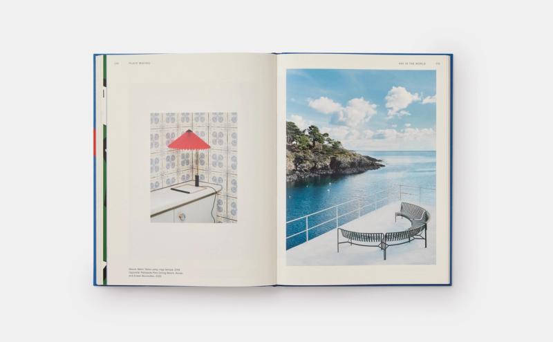
Last week, Phaidon released the first monograph telling the story of the brand’s universe, its trajectory up to now, and how it has expanded the notion of “Danish design.” The book’s editor, Kelsey Keith, the editorial director and acting creative director at HAY’s now-parent company, Herman Miller (and the former editor-in-chief of the design website Curbed), carved out a scope that tells the story of HAY’s work through the tenets of color, collaboration, and placemaking. The challenge of whittling down what made the cut, she admits, was no easy feat. The monograph includes interviews with and coverage of the brand’s products and collaborations, including with companies such as Ikea and Sonos, and takes space to communicate the input and influence that other cultural spheres such as art, food, and fashion have had over the course of HAY’s work to date.
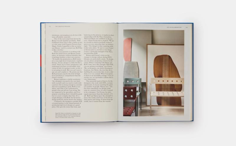
“One aspect we focused on that I find especially compelling is how many duos [co-founders] Rolf and Mette Hay have collaborated with over the years,” Keith says. “Everyone in the HAY orbit becomes family, in a sense, but the two-by-two relationships, such as brothers Ronan and Erwan Bouroullec or partners in life and studio like [Stine Gam and Enrico Fratesi of] GamFratesi, reinforce Rolf and Mette’s own ability to work in partnership. It takes intuition and an immense amount of honesty and trust to do what they do—and the results are greater than the sum of their parts.”
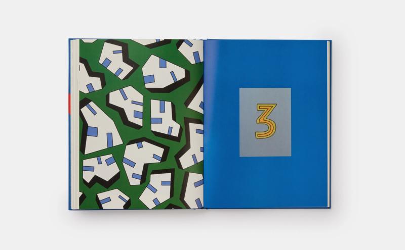
The pièces de résistance of the publication, beyond the objects on the pages themselves, are the book’s patterned pages introducing each new chapter. Like a new sheet of wallpaper for each room in a home, these colorful punctuations were designed by Nathalie Du Pasquier, Jodi Barton, and Richard Woods at the request of designer Clara von Zweigbergk, whose design for the monograph as a whole, is one of the reasons it manages to become an object that feels distinctly like a HAY ware in and of itself.