Stefan Sagmeister Finds Optimism in the Long View
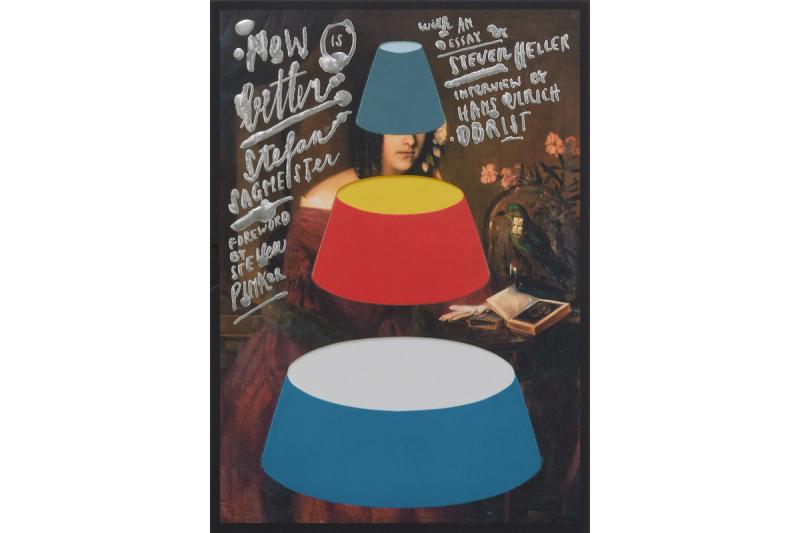
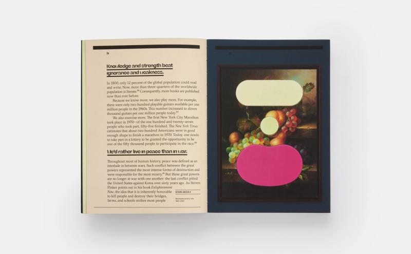
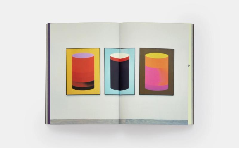
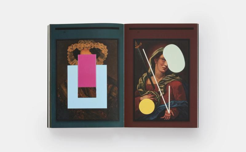
The Austrian-born, New York–based graphic designer Stefan Sagmeister has a rare knack for tackling broad, universal subjects—happiness and beauty, most notably—and distilling them in illuminating ways that offer new insights. For his latest project, the book Now Is Better, just out from Phaidon, he’s taken on the subject of long-term thinking, arguing that never before in human history have things been better for us as a species. Through exquisite graphic arrangements and sharp data sets, he shows that our circumstances are still improving. Now is indeed better. First started in the 2020 lockdown, the project vividly brings statistics to life through a range of media, including lenticular prints, artworks that inlay charts into 19th-century paintings, and even hand-painted water glasses.
Here, Sagmeister speaks about why all this data is giving him optimism and hope for our present and future; why humans have a propensity for short-term thinking and consuming negative news, and how to help change that; and his take on the ongoing, time-honored “What makes something art versus design?” debate.
When we last had a formal interview, for our At a Distance podcast, you told me about the origins of your Now Is Better project: your time as a designer in residence at the American Academy in Rome and a conversation you had with someone at a dinner party there about democracy. You also mentioned how you learned about the Long Now Foundation through Brian Eno, and how that thinking has had a large impact on your work. Now that you’ve created two gallery exhibitions and a book, how has this project reshaped your thinking and perspective on the world?
Well, since we’ve last talked, I’ve done much more research—talked to Steven Pinker, watched all of Max Roser’s developments of our world and data, and just immersed myself much more on the research side, if you want to call it that. But I’m looking at data. It’s not that I do field research out there.
On the creation side, [I’m making] not just the historic paintings and the lenticulars for the exhibitions, but all sorts of stuff: the Lobmeyr glass you’re drinking from, the watch that I’m wearing—we made twelve pieces that are in the world; all the way down to, let’s say, a series of tunnels for Toronto that connect the hospitals there, or a bike path in Arkansas.
It’s ultimately so fascinating to me that the difference between looking at the world in the short term versus the long term is literally, if not a 180-degree difference, a 179-degree difference. Meaning, it’s literally from, if we would look at today’s New York Times front page without actually looking at it, my guess would be—and I’m probably not wrong—that every single article on it would be about something negative. Now, if we would look at the same subjects from a hundred-year point of view, I can almost guarantee you that all of those would look very positive. If we look at natural catastrophes, even though we just had two major ones happening yesterday in Syria and Morocco, only ten percent as many people die today in natural catastrophes as they did a hundred years ago—even in absolute numbers, considering that we were many fewer people a hundred years ago than we are today. That’s really astonishing. If you look at it from a percentage point of view, it’s much more radical—it’s probably a couple percent. This has a lot to do with developments in forecasting. We can pick safety measures. Even though houses clearly still do collapse, they collapse at a much lesser rate than they used to.
It’s interesting, I just got an invitation to go to Ukraine and do a talk. Which, I would’ve gone, for sure. But I can’t make it, so I’m doing it online, and I’ll dare to do my Now Is Better talk in the Ukraine. I’ll see how that goes over. I’m sure I’ll do a caveat. In other talks, I’ve said, “I wouldn’t do a talk like this in the Ukraine, because if you are that close to the catastrophe and that close to war, I wouldn’t blame anybody for having their ears closed right now for this message. If you’re that close to the catastrophe, do you really care that there is another way to look at this?” I think I’ll try it. I’m not sure what will happen. I might get shouted at. It’s an experiment. I’m not sure if people will have the wherewithal to listen to this message.
There does seem to be a certain spirit to the Ukrainian people that.... I feel there might be a positive reception to this.
Out of all of the countries in the world, The Happy Film did nowhere better than in the Ukraine.
So this book is really about data—an unsexy topic—and yet it makes data exactly that, in such a wonderful way. In the book’s foreword, Steven Pinker writes, ‘“Data’ has become a scary word, a resource exploited by tech companies to steal our privacy and our attention.” Tell me about your approach to combining data and art in the way you did. What was your process?
Basically, when I discovered this completely different way of looking at the world, with a very different result from Twitter—X—and the daily news, I thought, This is a juicy problem for a communication designer! From the point of view I had, there were three difficulties: One, most media used by a communication designer is short-term. So how do I overcome that considering I’m talking about a long-term subject? Shouldn’t the medium that I’m publishing this also be long-term? Two, positivity by itself is boring. I’d much rather read scandalous, terrible news than positive news. Three, data and statistics inherently are seen as boring. At the same time, all of these things, if you look at it, the world from the long-term develops slowly.
In your book, Steven Pinker also writes—and this is in line with what you’re saying—“The news is a nonrandom sample of the worst things happening on earth at any moment, a collection of lurid anecdotes and images and narratives.” And in another essay in the book, you write, “Many things do go right, although the media has told us the exact opposite for years.” Was this project also a form of alternative media-making for you? It reminds me a bit of David Byrne’s Reasons to Be Cheerful.
I think the whole project is really trying to do a little bit of a counterpart to that. As you had mentioned, Pinker is in that business; definitely Max Roser is in that business; David, in some ways, is in this business. I think that I’ll be happy to add a voice from a different point of view toward that, from a more, I would say, communication design perspective. The more voices that would join that chorus, the better, because it’s meaning we are still a tiny, little, itsy-bitsy little thing against the much larger world of the news. And even in that world, I think.... I’m not sure if you know that German newspaper magazine called Die Zeit?
Yes.
I think they, more than most other publications, have managed to create a percentage of positive news within their mix. That seems to be very much appreciated by their readers. But we’ve seen that every attempt to make a real positive newspaper has failed because we just don’t like it.
I follow the Reasons to Be Cheerful Instagram, but I don’t read it all that often. It’s just really difficult to make positivity solidly interesting. I think that Die Zeit, better than most, is able to do that. They’re newsprint, and it’s a large paper, but it’s a weekly. So already they have an easier time. For example, they have these fantastic columns—and I, of course, call it “fantastic” because I was part of one. I think the column is called “A Person We Are Delighted About.” That also has an incredible advantage for the paper, which I wasn’t quite aware of until I was actually part of that column. They took the picture and made the interview, I think, half a year before they ran it, which, if it’s a person they’re delighted about, is no problem at all because hopefully that didn’t change after half a year. If they would’ve run a column that said “A Person Who Is a Total Shithead,” that person really had to have done something bad that week for this to even make sense. I think it has some real advantages for a publication to have some positive things in there, because they’re much less timely. Die Zeit literally goes against the trend. They have rising subscription numbers, so it seems to be working.
Another component of this project is ancestral thinking. You make a bunch of family connections to the work, writing about how your great-great-grandparents Jakob and Johanna Sagmeister experienced tragic deaths of not one or two, but six children, and how your great-grandparents Gebhard and Rosalia lost five children in their lifetimes. Did this reality make you feel lucky to be alive? How did you make sense of all this loss within the context of the data you were looking at?
Well, I brought them into the book for two reasons: One, because we have very good data about our family history. So I could basically just look that up and read all about it. Two, I wanted to make it much more personal. Because if you say, “Oh, in the eighteenth century, only fifty-five percent of all people reached adulthood,” it’s just not that convincing. But if you say, “This is my great-great-granddad and my great-great-grandma, to whom this happened,” and you can still say, “They were not unluckier than the rest of their countrymen and -women because this is just basically what happened.” It’s very difficult for me to say how much they suffered as compared to a contemporary family. Today, it’s basically unfathomable that you would know somebody who’s had six of their children die.
So you’re using the personal as a jumping-off point to reach universal truths.
Yeah. I’m now 61 years old. People say, “Modern democracy is in peril.” I remember from my own lifetime, when I was growing up in Austria, that Portugal and Spain were proudly fascist countries and all of Eastern Europe was under autocratic regimes. When we now complain about Hungary not being “as democratic” as we wish it would be, it’s good to remember that those countries are still very young democracies, decades old.
I enjoyed learning that, when you were studying for your master’s at Pratt Institute in Brooklyn in the early 1980s, your thesis was titled “Amazing, Exciting, Spectacular: Gimmicks in Design.” Tell me about this project and why you chose to focus on gimmicks.
I always had a fascination for them, and it makes sense in graphics and communication design, because you need to engage the viewer. I felt that this combination of being exciting or having a little sensation or having a little—well, being a gimmick—worked very well in the short-term engagement that you could count as a communication designer with your audience. It’s very different from what I’m trying to do now, but basically, if you’re sending out a card or if you are doing anything on a poster, somebody just looks at it for maybe a second or two. If you send something out and somebody needs to open it, or it pops up or you scratch it and it smells, or any of those things, you could hope that you would have a slightly closer connection with that person.
From that point, I was interested in gimmicks as a communication designer, but I also just liked them. I was close to them. I interviewed many people, many designers who had dealt with them, got to meet Tibor Kalman and Milton Glaser through that, many others. I was quite a resilient little fucker. I’d call people forty or fifty times before they’d pick up.
Do you think some of the ways you think as a designer today are in this gimmick mindset? There’s certainly a playful approach to your work.
Well, I think the gimmick mindset really came out of a short-term engagement. Which in this body of work I’m normally not trying. But as you see in the book, I’m doing lenticulars still, which of course comes out of that. Lenticulars are, of course, a gimmick. There’s no doubt about it. It’s the way they’re doing them—and you’ve seen the exhibition.
The recent one at Patrick Parrish, yes. It was beautiful.
I hope that they transcend. For me, they work very much long-term. I think I found the very best print production company to do them. I would say that they’re quite beautiful, and therefore transcend their origins. Because I looked long and held for the production of it, and actually, the book comes with a lenticular in there.
I wanted to basically create these lenticulars in an extremely simplified, quite modernist, minimalist direction where—
As if Albers made lenticulars.
Exactly! Which would easily be conceivable, considering [that] they would lend themselves to it. But from a technological point of view, it’s actually very difficult to do these lenticulars, because normally they try to hide the ghosting with as much pattern as possible.
Well, connected to this is beauty, which is the subject you’ve already written a book about—we talked about it at length on Time Sensitive. But I’d love to hear you elaborate here on beauty within the context of Now Is Better, about taking these old oil paintings and pairing them with these bold geometric shapes. How do you think about beauty in the context of this specific work?
Well, I think they’re pretty, those things. My desire and my goal is to make them as beautiful as possible because I know that that will increase the chance of somebody hanging it above the sofa. That’s a very conscious desire. I work long and hard on them. Many of these pieces go through dozens and dozens of iterations—from a compositional point of view, from a material point of view, from a surface point of view, from a color point of view, how they react or complement the painting. I put these pseudo-abstract images in there, but from a formal point of view, there are abstractions even though there is data hidden in them.
But as you’ve seen in the exhibition, the content is almost on the back burner. You have to figure out what the content might be of a particular painting. I think the desire is that they simply work as good-looking pieces on the wall by themselves.
And there’s this juxtaposition—and this is probably my favorite chapter in the book, “The World of Design versus the Art World,” an age-old conversation. Without getting too geeky on it, where is the dividing line between art and design for you? It almost seems like, in your mind, there’s a thick, blurry line.
The traditional definition—and one that Donald Judd voiced quite nicely—is: Design has to work; art does not. Basically, the dividing line is one of functionality. Art can just be, can do whatever it wants, doesn’t have to do anything. Design really has to work.
It breaks down when you really look at the details. I was just in Munich, and if you go into the residence of the Bavarian king there, you will see a gigantic dinner set that I am reliably told was ordered in France and went into the vitrine directly, never to be eaten from. Ultimately it’s a design that has no functionality other than it being displayed.
But I think the person who really broke it down the most beautifully and where it makes the most sense is really Theodor Adorno. And he has an essay in there where he says that division doesn’t make that much sense, because ultimately there is no hundred-percent functionality and there is no hundred-percent nonfunctionality, because even the most nonfunctional art—let’s say when Sol LeWitt says he totally takes himself out, and it’s just the pieces and they don’t have to do anything—well, somebody at MASS MoCA might go into the Sol LeWitt building and take a selfie in front of them, and actually many people do. Ultimately, Sol LeWitt’s pieces do become functional for something.
On the design front, in the book, I found it interesting how you reference Pruitt-Igoe, this disastrous social housing project in St. Louis that was technically built to be functional, but within months of opening was beyond dysfunctional.
And got dynamited fairly soon after. You could say that even though this entire project was built, meaning the architectural style at the time was functionalism, even though this was the desire, it really did not function. It was not fit for housing human beings. And I’m one hundred percent sure that if beauty would have been part of the goal of that project, it would still be standing and working today. It’s funny, because Max Bill, one of the most anal Bauhaus students—who founded the Ulm School of Design, which in Germany was famous for having function on the banner—did a lecture in Switzerland in the fifties where he said that he realized that we cannot pursue function [in and of] itself, that we need to lift beauty onto the same level as function, as treated as important as function, because he found out that beauty is its own function, and that it doesn’t work without it. That comes from the person who founded Ulm, which literally is functionality central. So it’s interesting to me that so many designers, so many architects stayed on function, even though their heroes clearly stated this shit doesn’t work. I very highly suspect that they stayed there out of laziness, because function is in many ways so easy to achieve. And beauty, in so many ways, is hard work.
So this book features a bunch of projects of yours. You mentioned some of them—the watch, the Lobmeyr glassware—but there’s also your clothing line and the Illy espresso cups. I wanted to ask, how do you decide when you say yes to a project, and were these projects all outgrowths of Now Is Better, in a way? Did these all come out of this thinking and work you were doing?
Yes. So basically, it’s now very easy. If a company lets me do Now Is Better [as part of the collaboration], I’ll do it. If they don’t, I don’t.
So your firm now is basically Now Is Better.
Exactly. I could literally, for now, completely rename it.
Now Is Better, Inc.!
Yeah! Recently, we had an electric car company call us and, because they’re an electric car company, I took the call. They asked me to do this and that, and I said, “No, not really, but this is what we are doing. If you’re interested, this is what I’m into.” People are like, “Oh, actually that’s interesting.” We ultimately wound up doing six Now Is Better images for them, and more power to them. I like their product.
I should say, it’s not that I suddenly think commercial work is bad. Not at all. It’s much more that I feel I’ve done enough of that. And if a client comes and they want to participate in that choir we talked about, fantastic.
Your clients become a vehicle—in this case, literally—for the Now Is Better message.
Yeah.
There’s another project you feature in the book, Move Our Money, for which you created large-scale data visualizations. This was a commission from Ben & Jerry’s co-founder Ben Cohen. Tell me a bit about this project, which preceded Now Is Better by around two decades. Was this the first instance of your applying this sort of long-view logic?
Well, the Move Our Money Project, really, I would say, was the first project where we took data visualization seriously and tried to make it fun and exciting. This was all about Pentagon budgets being reduced and moved over to health care and education. It was definitely the only nonprofit project I’ve ever been involved in that basically reached its goal—or, at least for a while, reached its goal. Obama implemented a lot of the things that we wanted, that we called for. Then, of course, Trump came and ruined it all.
It’s funny you say this, because I was curious about the final paragraph of the book, which is: “After a ten-year campaign, we found success in 2010, when President Barack Obama implemented significant parts of our program. In 2016, Trump reversed them.” That doesn’t seem a particularly optimistic way to end.
Well, I would say that it speaks to the fact that progress always comes in little bits. There are two steps forward, one step back. We still have, in the U.S. right now, an incredible amount of military spending. We are still spending more than the next ten nations combined. It’s wild. But if you look at other “first world” nations, it’s very different. I actually was reminded of it recently on a Zoom call with Yuval Noah Harari—I was not the only person on it—and he pointed out a very interesting thing. He said that his friends in Germany are now complaining that because of the war in the Ukraine, the German military budget that was always hovering around two or three percent is now being increased to five percent. Which, obviously, comes at the cost of some social programs. This money will have to come from somewhere, and there are some complaints about it.
Harari said that it’s also important to remember that, for a very long part of German history, the military budget was ninety percent, and so it was in France, and so it was in the U.K. The budgets of countries used to be ten percent for the king and the nobility around it, and social programs didn’t really exist, and nine percent was put aside for war. An increase from two to five is too bad, but within the context of history, it isn’t all that bad. I would definitely hope that as we move forward in this country, that we can reduce this to levels that are more in line with other civilized nations.
That’s a good way to end.