How to Design A Wine Label, According to Apartamento Magazine’s Omar Sosa
Omar Sosa, co-founder of Apartamento magazine and Apartamento Studios, has an unfussy love of natural wine. Here, he describes the process of developing a design for Vivanterre (a riff on the French term for “living earth”), a new line of natural wine produced by Patrick Bouju and Justine Loiseau, and founded by fashion insiders Rosie and Max Assoulin.
“For a long time, I had totally lost interest in wine—I was much more into beer. I’m not an expert, and always felt like wine was a little bit boring. I felt like I couldn’t tell the nuances, in one way or another, or remember the names of different kinds. I also thought I was allergic to red wine, or was intolerant in a way, because it didn’t make me feel good. Then I tried natural wine, not knowing anything about it, and it was like going into a whole new world. I like all the distinct flavors, and the more radical versions. Natural wines feel much more fun and relaxed. My whole position on enjoying wine is simple: Do you like how it tastes or not? That’s it.
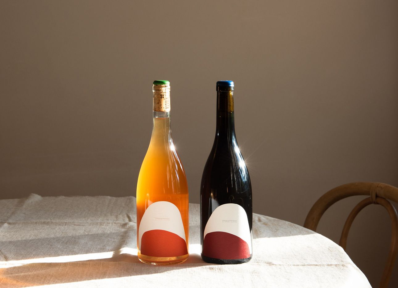
Vivanterre was really a collective project, with all of us working together in all senses. The starting point was not to repeat another label. The bottle that Patrick chose is very elegant, and I wanted to emphasize that. Our original idea was to not add any label at all on the front, and instead dip the bottom of the bottle into rocks: [creating] a tactile material, something you could feel and touch. We all loved that, but realized it was impossible to do, for practical reasons, because of potential breakage and other problems that would make the wine unstable. So we had to scrap that idea.
We went back to the idea of a label, but wanted to keep this same concept around the rocks. At first, I was against that, because I’m a bit more radical—I’m of the mind that you do it one way, or you start again from scratch—but there was an interesting tension that made us come up with the solution, which was not to use one label, but two, with one overlapping the other. In my mind, that was a similar gesture: It’s not a flat graphic. We took the shape of how it would have looked if we had dipped the bottle [into rocks], and converted it into a label.
When you drink a wine you like, you try to remember the name, but that’s not always easy—the names can be quite experimental, and there are different languages involved—so having a distinct, recognizable graphic was always a priority. Rosie and I both have a strong sense of color. We ended up with a shape and color play that, while you may not remember the name Vivanterre, you’ll definitely remember how it looks.”